New Branding & Website for Aldeburgh Golf Club
We were delighted to produce new branding and a fresh website for Aldeburgh Golf Club recently.
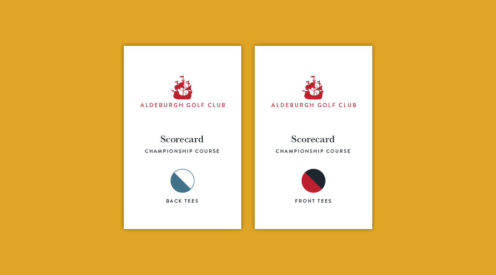
The club modernised their logo to encorporate the ‘Red Ship’ that had been a popular motif used on clothing but never as an official logo. We were able to oversee this implementation across all aspects of the club and tighten up with brand guidelines that have previously never been in place.
The new website acts as a brochure to showcase the golf course and its facilities to a potential members and visitors – removing the need to cater for the current members who only use the designated members area. We worked with Intelligent Golf (members area provider) to ensure that the brand was carried across into their system.
“
We have been pleased to work with Juiced over the past 18 months during which time they have helped us re-brand and develop a new website. Tom and the team have combined professional skills and experience with his passion for the game and a deep understanding of the Club to guide us through every step of the process and, critically, they continue to manage the website for us pro-actively and creatively to ensure that it remains up to date and informative for members and visitors.
David Wybar, Club Secretary
Aldeburgh Golf Club
More Projects
Honey + Harvey
ShareA delicious brand update and website for Honey + HarveyWe worked with Honey + Harvey to sharpen their brand as they became busier online through the pandemic. It was clear that guidelines needed to be in place as the business started to open more outlets. The...
Little Gems
ShareNew look for Southwold GrocerSouthwold Grocer, Little Gems received a new look recently with everything from logo to the look and feel of the front of the shop. We worked with the owners to achieve a modern yet traditional look across the business. I'm proud each...
Smith & Cork
ShareElectrified branding for Bungay based firmSmith & Cork came to us looking for something different from the typical white van look for their electrical firm to help win bigger pitches. They instantly loved the new logo featuring the '+' at its heart. We...


